Head to any supermarket, shop, or corner store that sells wine and you will find hundreds of bottles on multiple shelves. Reds, Whites, Rose, Fizzy, French, American, Italy, etc, etc. How does a consumer choose? Unless they are a loyal brand follower most of them will pick a bottle based on the label. All the work you have done to get that grape from the vine to the bottle and in the end it comes down to the label!
It’s make or break time.
So how do you get your bottle to stand out from the competition and get someone to pick up your bottle of wine and head to the checkout?
It's all in the Design.
1. Know thy audience
Are you going after the fun and casual buyer, or maybe sophisticated, bold buyer? Determining your audience is the first step in designing a wine label. What does your Brand stand for? Are you looking to appeal to the younger millennial generation, who are drinking more wine than any other before it? Or are you looking for an older more traditional buyer?
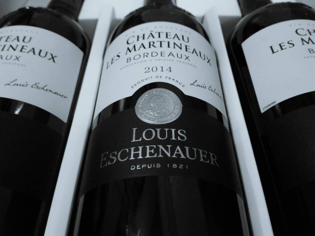
2. Design
When deciding on your design your need to look at the different attributes for the label, like it’s shape, colour, typography, and imagery. These will define your Brand and what audience you are talking to.
Shape
Traditional labels are rectangular and they give you the most usable space. They are great for well known and old world brands. They can also be used for large drawings or imagery.
Labels that are non-rectangular shape or die-cut can help a bottle stand out from the crowd. They can draw in a buyers attention and convey a fun or quirky brand. While it can make the label more expensive it is a great way to make your brand and label really pop.
Colour
With your colours not only do you need to consider the feelings you are trying to convey, you need to take into account the colour of the wine and bottle. Red wines are sold in dark green or brown bottles to help keep out sunlight and sold oxidization where as white and pink or rose are in clear to highlight the color of the wine. Reds tend to use deep dark colours to convey a moody or rich feeling. Light blues and greens are used with White wines to create light and crispy feelings. Trying using your Rose’s colour as a backdrop for your label.
Typography
Young and hip brands will look to use bold sans serif fonts to create a contemporary feel. High end, traditional and old world wines will use more scripts and serifed fonts to create feelings of authenticity and history.
Imagery
Traditional brands with use a lot of line or pencil drawings, typically of vineyards, or the estate. Contemporary brands might use abstract art or photos and minimalist brands might just be a simple logo. This is where you can really show off your uniqueness and what sets you apart from everyone else. Use it to tell your story or start a converstion with the buyer. Whatever you choose it should be eye-catching to draw the buyer’s attention.
3. Materials
Here is where the paper and finishes touches set you apart. Here a variety of techniques can be used to enhance your label. You can use textured papers, foil stamping, embossing, debossing, die-cutting.
4. Back of Label
After all this work for the front label don’t forget the back label. You can share interesting facts or a story about your vineyard, or tasting notes. You need to make sure you have all the legal labelling requirements met too, like any government warnings, ABV and UPC codes.